

An evaluation of exhibit design at the London Science Museum
Autor: Joshua Kaufman, product designer - San Francisco.
Članak je preuzet poštivanjem autorskih prava definiranim u Creative Commons License
Summary
As a previous employee of a large urban science museum, I realize how difficult and complex interactive exhibit design can be. There are several main challenges, many of which have been discussed in this paper. If we review these challenges, we can create a short list of guidelines or best practices for exhibit design.
- Exhibits must be designed for very frequent use, often with thousands of users per day.
- Exhibits must accommodate as many body types as possible.
- Exhibits must be understandable and easy to use.
- Exhibits must accommodate different learning styles with a preference towards the dominant learning styles.
Introduction
This is my graduate school work: An evaluation of exhibit design at the London Science Museum. On 11 February 2004, our class had the opportunity to visit the Science Museum. The aims of the visit were
- to observe and evaluate and wide variety of walk up interactive exhibits,
- review the use complex systems in public spaces,
- to envision better approaches and their likely impact on the museum and its visitors and
- to define best practice for walk up interactive exhibits.
While at the Science Museum, I observed many different types of exhibits while focusing on physically interactive exhibits and graphically interactive exhibits. This paper will outline the problems I observed as well as potential solutions. I’ll start with a discussion of physically interactive exhibits and then proceed to discuss graphically interactive exhibits.
Physically Interactive Exhibits
Frequency of Use
Needless to say, frequency of use is a major factor in the design of museum exhibits. They must be built to withstand thousands of uses per day and a fraction of abuses during the same time. Ordinary use considerations can be thrown out the door. Buying an off the shelf product and attaching it to an exhibit isn’t an option. Each component of an exhibit must be carefully designed in order to survive daily use and beating. Figure 1 shows a roller mouse specifically designed for such heavy use. To start, it’s solidly mounted on the front of the exhibit. Also, instead of an ordinary button that one would find on a store bought roller mouse, it has a big durable button made for use by big and small hands alike.
Frequency of use considerations are valid not only for the tangible aspects of the exhibit but also for parts of the exhibit that the public can’t see. Examples of devices that didn’t pass the test in this area are the finger print readers attached to many of the interactive kiosks in the Wellcome Wing of the museum. Quite simply, most of them didn’t work and no one knew why. Were they not tested adequately before being released for public use or was it a software design flaw that caused them to be nonfunctional during our visit? Either way, if their frequency of use was fully considered during their design, we might have been able to use them during our visit.
Physical Ergonomics
Physical ergonomics alone plays one of the greatest roles in the safety and use of exhibits. All the typical ergonomic considerations should come into play here: task analysis, identifying limiting users, postural assessment, fitting trials and risk assessment. At the Science Museum, most of the exhibits seemed to take ergonomics into consideration as I imagined people with different body types being able to use most exhibits.
However, there were two main ergonomic issues I identified while visiting. The first issue was exhibits that are specifically designed to be used by children. One such exhibit is shown in Figure 2. I imagined myself walking up to this exhibit with a small child and showing them how to use it before letting them try it. As you can see from the figure, this would prove to be relatively difficult. While it can sometimes be a good idea to design specifically for small children, it can also be difficult for anyone of a larger size —- or in my case, a much larger size —- to use and explain the exhibit. In many cases, this takes more away from the exhibit experience than it gives to it. The second issue I identified was exhibit —- in this case, kiosk -— design being dictated by the design of the exhibit space. This was often the case in the Wellcome wing of the museum. Each floor of the wing had its own theme and each theme had its own unique design. Figure 3 shows one of these floors which had a very futuristic look and feel, with large metal structures spread across the floor. I’ll be the first to say that that it looks really cool. Unfortunately, this is a classic Don Norman case of aesthetics getting in the way of basic usability, or in this case, basic ergonomics. I sat down in several chairs and used several kiosks that were very uncomfortable because they were designed to look cool or high tech. This is a completely unnecessary side effect of the floor space design and could have been avoided if the designers were thinking as much about human needs as they were about eye candy.
Affordances
In order to interact with an exhibit easily and intuitively, it must have clear and understandable affordances. That is, the exhibit must afford its use through physical cues. Many of the interactive exhibits at the museum had strong affordances. Figure 4 shows me using an exhibit that explains Bernoulli’s principle with a stream of air and an inflatable beach ball. The stream of air is coming from a flexible plastic tube that practically screams out to be grabbed and bent in various directions. As you direct the stream of air against the ball, it seems to defy the laws of gravity. Something interesting is happening so you’re compelled to read the short description of what’s going on. Even if you don’t read the short description, you can still take your interesting experience with you, knowing that some things in this world are not what they seem.
Unfortunately, not every exhibit had such obvious affordances. Many exhibits were so abstract that that you were absolutely required to read the description before you could use them. This is poor exhibit design. It should be obvious how to use an exhibit just by glancing at it. If it isn’t, the design should be reconsidered and redesigned in order to make its use more understandable through simple physical cues.
Understandability
An exhibit can be very easy to use, but if the visitor can’t know what scientific concepts are in play without assistance, there’s no point in even touching it. That is, it exhibits must be understandable and accommodate learning. I observed situations where this was not the case several times while I was in “Launch Pad,” (Figure 5) the “hands-on interactive area” of the Museum. Many of the exhibits were very fun and educational but only when facilitated by an “Explainer,” the Museum’s title for someone who someone who demonstrates and explains exhibits. When there was no Explainer around, I observed many children interacting with the exhibits as if they were oversized toys. In one exhibit, the idea was for the visitor to tip toe on the exhibit surface in order to light up as few bulbs as possible. There was a written description that explained this, but of course the children didn’t have the desire to read the description so they had no idea what the goal of the exhibit was. Instead they jumped up and down on the exhibit surface as hard as possible in order to light up as many bulbs as possible. What child doesn’t want to make things light up?
Direction Manipulation vs. Push Button
There were two main types of interactive exhibits at the Science Museum: direct manipulation and push button. The exhibit described above is an example of a direct manipulation exhibit. Visitors can manipulate exhibits directly and immediately see the consequences of that operation. The other type of exhibit is a push button exhibit. In this type of exhibit, the only object that users can manipulate is a button or maybe a lever that brings about some observable action and effect.
From my experience, there will be a greater transfer of knowledge when visitors can directly manipulate an exhibit. By directly manipulating the exhibit, the visitors can immerse themselves in the learning experience. Simply pushing a button and seeing something happen in the distance just doesn’t have the same effect on someone as actually holding something and causing something to happen by maneuvering it in space.
Exhibit Description
The exhibit description of each exhibit has its own unique challenges. In some situations, such as the Cessna shown in Figure 6, there isn’t adequate space for a complete written description of the exhibit. Instead of trying to cram all of the information into a smaller space, the designers cleverly used a different mode of information transfer: sound. After sitting in the cockpit of the plane, the visitor can press a button that begins and audio description of the different actions the visitor can take while in the plane. In most cases where audio is used, it’s very effective in explaining the exhibit. This arises from the simple fact that most people are lazy and would rather get information passively rather than actively. However, producing an audio description of exhibit is much more expensive than writing written descriptions so audio descriptions are much less common.
Graphically Interactive Exhibits
Graphical interaction is inherently different than physical interaction in many ways, but much of the design principles remain the same. However, because computer interfaces generally don’t involve objects in the physical sense, there is less emphasis on the physical ergonomics and a grater emphasis on understandability and learnability.
Since nearly all of the museums computer exhibits are in the Wellcome Wing, all of the following examples refer to exhibits found in that area of the museum. There were several main categories of issues that I found in this area: 1) misuse of technology, 2) interface consistency and 3) nonfunctioning exhibits.
Misuse of Technology
One of the most frequent problems that I encountered in the computer-based exhibits was a misuse of the technology. By this I mean that many kiosks were simply interfaces to long strings of text. Figure 7 shows an example of this type of exhibit. It presented an opening paragraph with several options. When I clicked one of the options, another paragraph appeared with a continue button. Disappointed, I continued reading and then selected the continue button. Another block of text appeared. I couldn’t understand why the museum would choose to use computer kiosks to deliver blocks of text. It seemed that the computer was being misused. Why not use a large board with the information printed on it? At least that way, visitors wouldn’t have to use touch screens and a confusing navigation to move through the text. Or maybe the same information could be presented in a more engaging and interactive way? That would have at least held my attention to the computer screen.
Interface Consistency
There were many kiosks in the Wellcome Wing that did use more interactive elements that I found much more appealing than the previously mentioned kiosks. But much what these kiosks gained in interactivity was lost in the complexity of the exhibit interface. In the over 20 different computer kiosks that I used during my tour of the Wellcome Wing, not one shared the same interface. Each kiosk presented me with a new type of navigation, new menu options and often a new input method. The first thirty seconds to a minute of using the exhibit was usually dedicated to figuring out how this one worked.
I should mention that even though the interfaces were different in each case, many of the interfaces were clever and intuitive. Sadly, there were just as many interfaces that were too flashy and overly complex. Even though the subject matter of each kiosk is different, the interface of each kiosk need not be completely different than the last. It seems that too much creative freedom was given to the kiosk designers without any unified vision for the exhibit design.
Nonfunctioning Exhibits
Lastly, many of the exhibits were broken. In this case, they either had notices attached to their screens or computer errors —- usually Windows errors -— declaring an exception fault or something of the like. Two things occurred to me when I saw these errors. The first is that the designers did a sloppy job of error handling, one of the basic components of any basic programming course. The second is that the kiosk was poorly designed, either from an industrial design perspective or from a software design perspective. What’s most ironic about this is that the Wellcome Wing was created to showcase the latest in science museum technology, and many of the kiosks are nonfunctional. It’s somewhat indicative of the current state of technology.

Figure 1. Roller mouse. ↑

Figure 2. Children’s exhibit. ↑

Figure 3. Wellcome Wing floor. ↑

Figure 4. Bernoulli exhibit. ↑

Figure 5. Launch Pad. ↑

Figure 6. Cessna exhibit. ↑
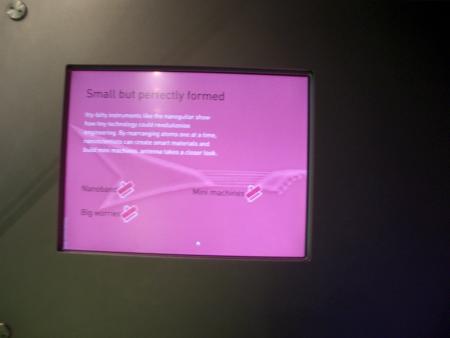
Figure 7. Interactive computer exhibit. ↑